
Here you'll find all of our bottle cap design resources, tailored to help both beginners and experts alike create successful bottle cap designs. You can jump to a specific section below, or read the whole thing.
→ Introduction to Making Complex Designs
Learn why BottleMark recommends using offline programs to create better bottle caps.
→ Working with Transparency
Make the most of BottleMark's caps by learning how to work with white color and transparency.
→ Design Tips
Learn the do's and don'ts of bottle cap design.
→ Sample Designs
See the design tips in action with these bottle cap photos.
→ SVG Templates
Want a shortcut? Check out our SVG templates. You'll find library designs and general-use templates ready to download and customize.
→ Inkscape Design Screencasts
In this series of videos, we show you the most important Inkscape tricks for bottle cap design, from cropping photos to creating circular text.
If you want a real-world preview of your cap, don't forget: you can always order just one cap!
For design help, requests, or inquiries, contact Haley E. R. Cooper. And we can always design something for you for a small fee.
Our online design tool allows you to upload an image, resize it, and reposition it, but if you want to add text or multiple images to your bottle cap, you'll need to use a separate design program and export the final design as a single image. You can use any drawing program that outputs in PNG, JPG, or GIF to create designs for BottleMark custom caps. And pretty much every drawing program will! You may already have Photoshop, Paint Shop Pro, or Illustrator—even Powerpoint can work.
For simple operations like putting text on an image, you can do it online. We recommend Watermarkly.
For more involved designs, our favorite is Inkscape. It's a free vector drawing program that works on Windows, Mac, and Linux. While Inkscape offers many sophisticated features, it won't take you long to master the tricks you need to create a great cap. We've got screencasts below to help you, as well as Inkscape SVG templates. So give it a go!
BottleMark custom caps use white ink: that's how we can print on colored caps and keep your colors bright! White ink and colored caps make for some awesome design possibilities—if you know how to use them. But there's a risk: if you're not careful, you'll end up with white boxes on your cap where you don't want it. Read the tips below to harness the power of transparencies.
What's transparency? A transparency in a design is a signal to our printer not to print any ink on a given area. You can use transparency as the background, or as a knockout element in the foreground, like a graphic or some text. This is a nifty technique if you want to use a cap's original color as part of your design for a seamless, "stamped on" look. If you've done it right, your element will appear transparent on your preview cap on the upload page.
Making a transparency in Inkscape: Open your SVG design file, click on the element you want to be transparent, and click on the X-box (to the far left on the color bar) for the fill color. Then make sure to export it as a PNG! (If you're using another design program, search Google to find out how to set transparency in that program.)
File type: PNGs! Some file types don't recognize a difference between the color white and a transparent graphic element. JPGs always convert transparent elements to the color white. If you have transparent elements in your design, make sure to save your file as a PNG! Don't worry: you'll be able to tell quickly if your transparent elements uploaded properly. Just check to see if you can see the original cap photo in your transparent area on our upload tool. If you can't see the cap photo, you're looking at a field of white ink.
Getting rid of unwanted white areas: Let's say your graphic has a white background that you don't want printed on your cap. Go to an advanced photo manipulating program (like Photoshop or Gimp), and use the Fuzzy Select tool to quickly delete the undesired white areas. Then export your image as a PNG. Need help? Email me for assistance.
We can print anything you want on a cap, but some designs look better than others. Here are a few pointers on successful bottle cap design:
Pick the right cap color. To make your graphic pop, choose a cap color that compliments the image. Don't put a black logo on a navy cap, or a light logo on a white cap. Follow good color-contrast rules: put light colors on dark and dark colors on light.
A bottle cap is small. 1 inch in diameter: this is a very small canvas! Don't expect tiny details to reproduce well. Make sure that all your design elements are clear and legible at the size of 1 inch before ordering. Avoid over-designing your cap—save the crazy stuff for labels! Zoom in on your image as much as possible so the subject is as large as possible.
Use square or circular designs. Since the printable area is a perfect circle, choose an image that works when cropped into a square or circle. A rectangular image can work, but you'll need to make it smaller to get all of it on the canvas: you lose detail and add wasted space. So think circular!
High-contrast colors. Be bold with your colors. If you have many layers to your design, make sure that the background and the foreground graphics have a strong dark-to-light color contrast. Watch out especially for royal or dark blue-on-black; both of those are dark colors! Black-and-white and richly colored pictures look beautiful on caps. The more contrast in the photo or graphic, the better it will read at the size of 1-inch.
Big text. When it comes to text, the bigger the text, the bolder the font, the better. Tiny text is a common mistake, and you don't want your text to end up illegible! Make sure text contrasts with the background color. Pay special attention if you're working with text on a photo background. If text is the most important part of your cap, use solid backgrounds to make your text "pop." All varieties of fonts can work, but avoid thin and super-frilly fonts.
Transparent elements: Our printer will print ink for every color in your design, including white, unless you make an element in your design transparent. We can print designs that use the cap's natural background color, but you need to make sure you tell our machine what needs to be transparent. See Working with Transparency for full details.
Leave a margin. We print to the edge of the cap top; since the rounded edges of the cap are rounded even more in capping, elements that are all the way to the edge can be rounded with the cap. Leave a little space at the edge.
Below is a screen shot from the design tool and a photo of the resulting cap.
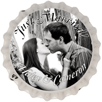
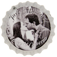
While the black-and-white photo turned out lovely, the text is a disaster! Even with a stroke around the text, the font looks too narrow and blends in completely with the gray areas of the photo. This is no good!
Now see the improvement. We used the same photo and even the same curly font but changed the font color.
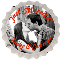
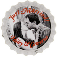
Better, but it's not perfect. It still looks a little garbled.
Now this is the best choice. We've deleted the text, enlarged the photo, and made the design all about the cute image.
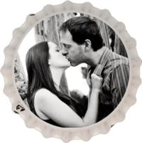
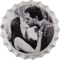
So why couldn't we get the text to work? This photo has both dark and light areas, so we couldn't pick a single text color that truly popped. If you want your text to pop but your image isn't cooperating, put it on top of a simple background, like this:

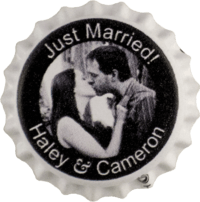
Now we've got the color contrast we need to have easy-to-read text. The photo's not as prominent as in the last design, but we do get the text loud and clear.
Here's another example of bad text contrast.
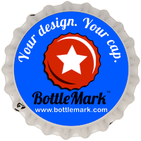
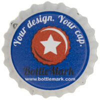
The white text shows up clearly on a blue background, but the black text doesn't show up nearly as well. Black and blue are not a strong light-against-dark color combination; they're both dark colors. Opt for white or light colors against blue.
Here's an example of a rectangular graphic forced onto a circular canvas.
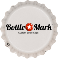
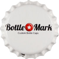
The "Custom Bottle Caps" text is just barely readable. Even though the graphic stretches from edge to edge, it is way too small, and there's a lot of wasted space, too. Best to start with an image that looks great as a circle or square.
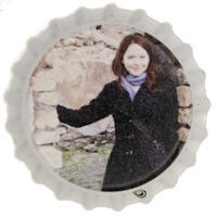
Although the face is small in the cap below, it still turned out perfectly distinct. We don't recommend going much smaller though.
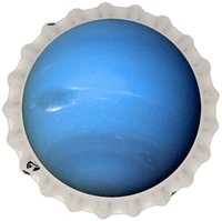
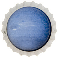
This cap—a picture of Neptune—is a good example of not having enough detail. It printed correctly, but it's a pretty boring cap!
Not a design whiz? Here you'll find bottle cap design templates ready to download so you can customize your own.
The files are SVGs (Scalable Vector Graphics). You can open them in a number of programs. We like Inkscape (it's free). Many of our templates use fonts you may not already have, and if you want the same font you'll need to download it from dafont and install it on your system first. (We use 100% free fonts; specific links provided below.) Once you've opened the template, you can change text, fonts, add graphics (File: Import), do whatever you'd like!
Once you're satisfied with the design, go to "File: Export Bitmap". In that dialog choose to export "Page" at the top, make sure the width field is at 500, pick a file name (it'll be a PNG), and click the button to export your design. This'll give you a format BottleMark can take. You can upload your PNG design in BottleMark's design tool and order that awesome cap!
These templates are what we use to make the designs in our cap library. Don't forget to download and install any fonts first, and then open the templates!
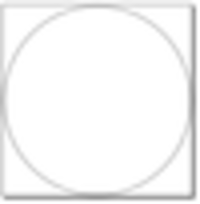 Empty cap template:
this very basic file features a perfect circle. Note that the circle's fill is set to transparent. You can change it to white or any other color if you want a colored background. The circle also has a thin black stroke around it as a design guideline. If you don't want a black outline on your cap, before you export your design, set the stroke on the circle to transparent (Object: Fill and Stroke), and the outline will disappear.
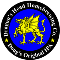 Complex template: this file features some common desirable design elements: a smaller circle within the larger circle, a center graphic, and curved text. Use this template if you want something totally customizable but want a headstart on certain design elements. You can change colors, alter the text and font, delete the graphics, upload your own. We pulled the awesome dragon from Inkscape's Open Clipart Library (available under File).
If you want a picture (instead of a graphic) in the center:
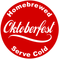
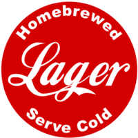 Soda Shop Swirl / Soda Shop Plain: a tribute to the vintage soda cap. Customize the text to whatever's brewing. Fonts: Loki Cola and Arial Black.
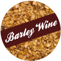 Barley: features beer style with a photographic barley background. Font: Ballpark Weiner.
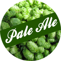 Hops: features beer style with a photographic hops background. Font: Ballpark Weiner.
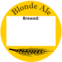 Brew Date: features beer style with room to write in a date. Font: Imprint MT Shadow.
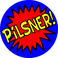 Comic Book Pow: features beer style in bold comic book style. Font: BD Cartoon Shout.
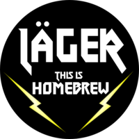 Heavy Metal: a parody of Hard Rock aesthetic. Make sure to move the umlaut to a fun location. THIS IS HOMEBREW! Font: Metal Lord.
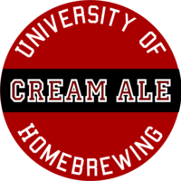 University of Homebrewing: features beer type with curved text "University of Homebrewing." Change the colors to your favorite school. A complex design: delete the center text along with each letter's fill, type your center text, and then use the paint bucket to fill red (or any other) color in the space in the letters made by the Allstar font. Fonts: College and Allstar.
home | upload & customize | design library
info : contact us | production/shipping | faq | newsletter | privacy policy | more…
Copyright © 2011-2026 BottleMark LLC. All rights reserved.
